Microbiome Analysis and Hypothesis Testing
- How do we ask the questions we are actually interested in?
- Observations of the community are great, but don’t address a hypothesis
- We can both visually and statistically draw conclusions about microbiome composition
Ordination and Composition Analysis
First an example…
They looked at how patients responded to treatment, and how that related to survival…
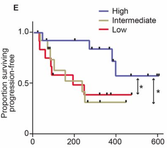
Survival of melanoma patients with response to anti-PD-1 immunotherapy. Source: Gopalakrishnan, V. et. al. Science. 2017. doi: 10.1126/science.aan4236
They also looked at the gut microbiome as an ordination…
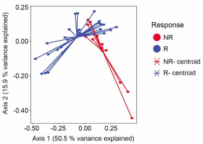
Microbiome ordination highlighting response to anti-PD-1 immunotherapy. Source: Gopalakrishnan, V. et. al. Science. 2017. doi: 10.1126/science.aan4236
What does this ordination show?
- Each dot represents an individual sample… a measure of their total gut community
- They colored each dot based on whether they responded to treatment or not
- How close two dots are shows how similar their microbial communities are
- Closer = more similar
- Farther = less similar
- The controids show where the middle, or average, is for responders and non-responders
- While some individuals from each group overlap, there is clear divergence in the average for each group
- Axis 1 and 2
- These are components of variation measuring differences across all the microbiomes
- The percent variance explained shows how much difference in microbiomes is captured along that vector
- These are somewhat arbitrary and are a result of the variation in the data
- Specific to the samples and features going into the analysis
- Tip: Do not compare between ordinations, only within an ordination!
- Ok… but what is an ordination?
- A way of collapsing variation in complex data along vectors
- Hundreds of samples and thousands of microbes can be drawn into two dimensions
- Each dimension captures a percentage of the total variation in the data
- 50% of variance like above means there is a lot of difference being captured
- In noisy data (Human Microbiome Project) 5-20% is a lot of variation to be captured by one dimension
- A really useful approach to quickly see patterns in data, however…
- Treat these as qualitative exploratory analyses, and not quantitative of effect size
- Information is lost when data is collapsed from N to two dimensions
- Underlying math can be biased depending on data distributions
- Don’t give quantitative stock to things like centroid distance
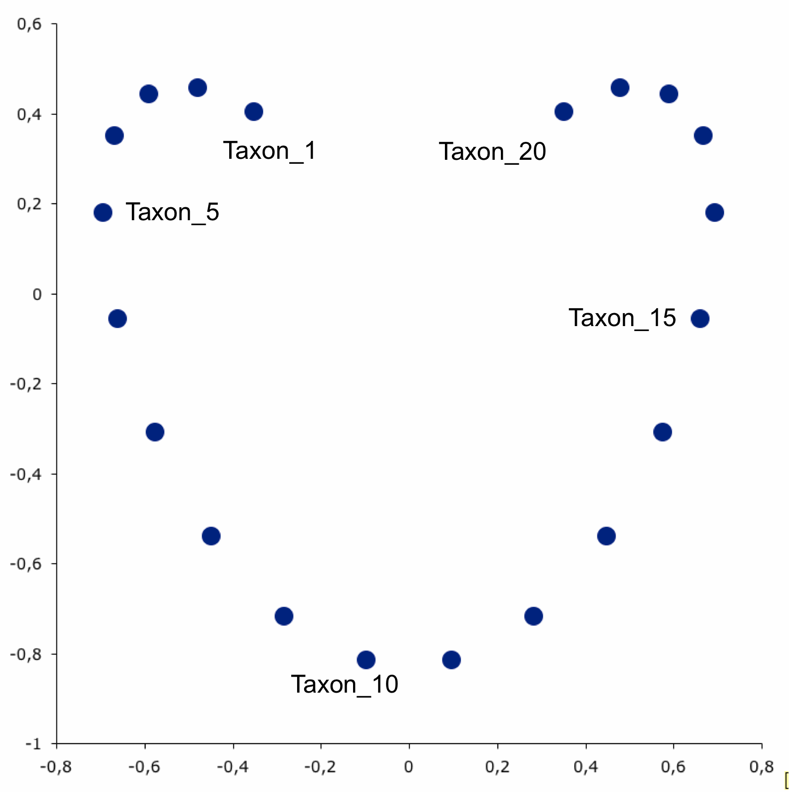
Here is my favorite example using human genetic data:
Ordination with horseshoe effect. Source: https://www.nature.com/articles/nature07331
- Here is a great example of one way things can go wrong…
- Let’s say there are 20 taxon in an ordination
- Linearly related with taxon 1 most distant from taxon 20
- Clearly we don’t see that below
- Has to do with a unimodal effect distortion in eigenvector space… go find a statistician to translate
Ordination with horseshoe effect. Source: https://phylonetworks.blogspot.com/2012/12/distortions-and-artifacts-in-pca.html
Diversity Analysis in More Detail
- Before we assessed alpha diversity between categorical groups
- What if your variable of interest is continuous?
# for each alpha diversity metric...
for alpha_metric in faith_pd shannon observed_otus evenness
do

   # Calculate alpha diversity correlation
   qiime diversity alpha-correlation \
      --i-alpha-diversity "$diversity_folder""$alpha_metric"_vector.qza \
      --m-metadata-file "$map" \
      --o-visualization american_gut/2_5_alpha_correlation_"$alpha_metric".qzv

#Remember to close the for loop
done
And then we can view the results…
alpha_metric=shannon
#alpha_metric=faith_pd
#alpha_metric=observed_otus
#alpha_metric=evenness

qiime tools view american_gut/2_5_alpha_correlation_"$alpha_metric".qzv
- Uses non-parametric Spearman correlation, which works off ranks like Kruskal Wallis
- Microbiome data is not normal, predictable, and thus will cause problems with many statistical tests
- QIIME2 uses the proper tests to account for this
- If you are trying to implement your own test make sure you know that limitations and caveats
- Let’s look at beta diversity across groups
- There are lots of options: qiime diversity beta-group-significance –help
- Permanova & Anosim tests
- Permanova - mathematically more like a regression
- Anosim - more like an anova
- If your variable is categorical I’d do both
# Calculate correlation of variable with beta diversity
qiime diversity beta-group-significance \
   --i-distance-matrix "$diversity_folder"bray_curtis_distance_matrix.qza \
   --m-metadata-file "$map" \
   --m-metadata-column bmi_cat \
   --p-pairwise \
   --o-visualization american_gut/2_6_beta_significance_bmi_cat_bray_curtis.qzv

# View results
qiime tools view american_gut/2_6_beta_significance_bmi_cat_bray_curtis.qzv
- How would you change this function to be more adaptable in a pipeline?
- Multiple metadata columns
- Multiple beta diversity metrics
Community and Taxonomic Differential Abundance Analysis
What if we are interested in features or taxa that are shifting in abundance?
- First let’s examine abundances across samples with a heatmap
- But Feature numbers like 48437593 are not very informative
- Let’s collapse our table by bacterial taxonomy first
# Collapse at taxonomic level
qiime taxa collapse \
   --i-table "$table" \
   --i-taxonomy "$tax" \
   --p-level 5 \
   --o-collapsed-table american_gut/2_7_taxonomy_collapsed_l5.qza

# Make a heatmap
qiime feature-table heatmap \
   --i-table american_gut/2_7_taxonomy_collapsed_l5.qza \
   --o-visualization american_gut/2_8_taxonomy_l5_heatmap.qzv

# View the heatmap
qiime tools view american_gut/2_8_taxonomy_l5_heatmap.qzv
- Always remember to check the docs
- qiime feature-table heatmap –help
- Options to normalize or not (default = True)
- Options for the metric to calculate sample distance (default = Euclidian = bad)
- Options for the method to use when clustering (default = average)
- I wouldn’t use the default metric and clustering method
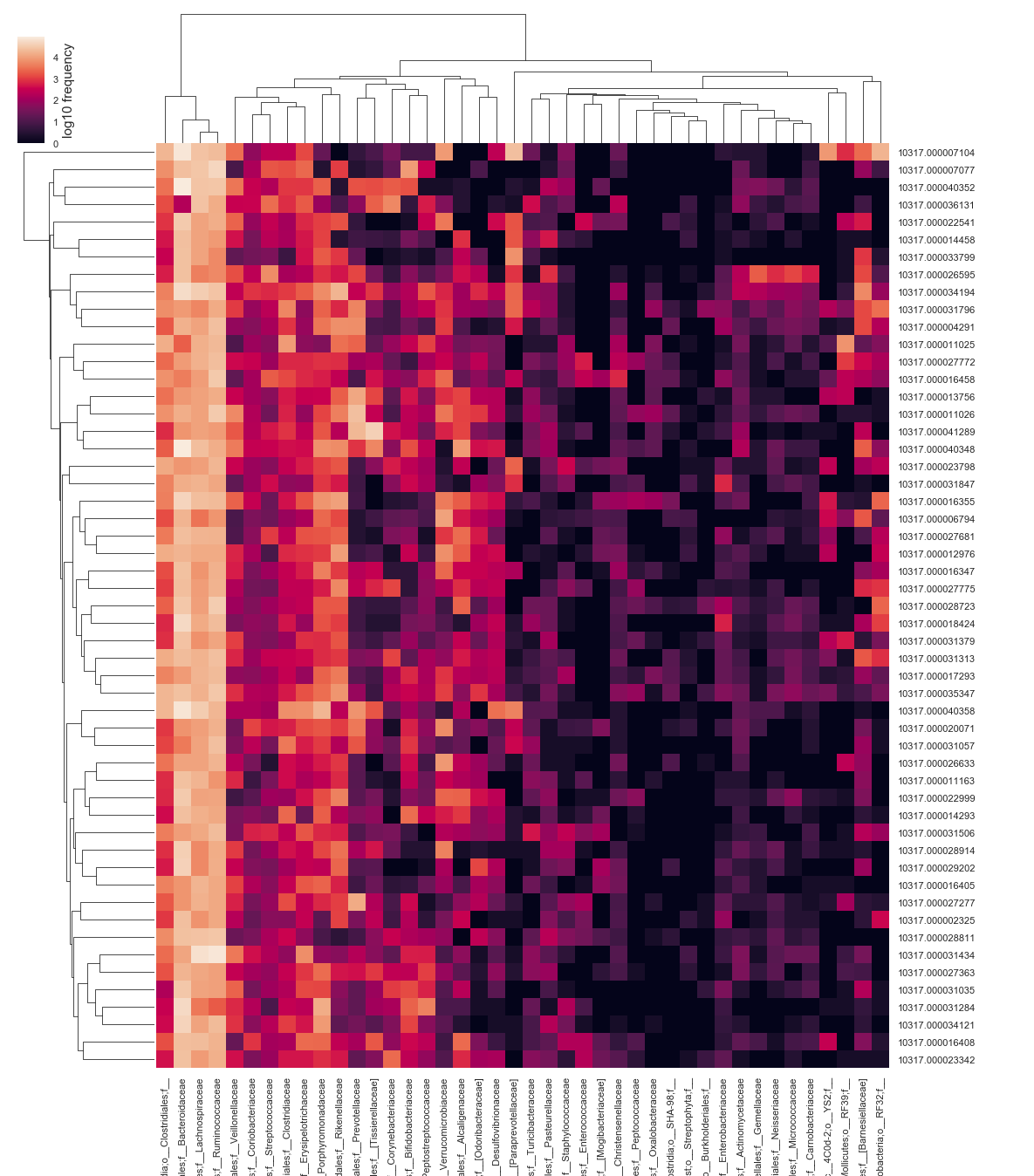
Heatmap at the family level.
Finally let’s statistically assess which of these are varying across groups
qiime composition add-pseudocount \
   --i-table american_gut/2_7_taxonomy_collapsed_l5.qza \
   --o-composition-table american_gut/2_7_taxonomy_collapsed_l5_composition.qza

qiime composition ancom \
   --i-table american_gut/2_7_taxonomy_collapsed_l5_composition.qza \
   --m-metadata-file "$map" \
   --m-metadata-column age_cat \
   --o-visualization american_gut/2_9_ancom_l5_age_cat.qzv

qiime tools view american_gut/2_9_ancom_l5_age_cat.qzv
- Oh No! Nothing significantly varies.
- Feel free to try other variables
- Ancom is very conservative
- Keep in mind this may happen to you!
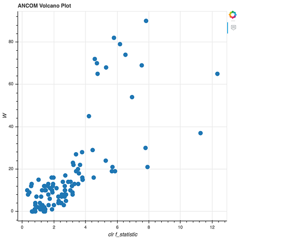
Ancom results, with x-axis summarizing difference between species, and y summarizing the test statistic. Source: https://forum.qiime2.org/t/how-to-interpret-ancom-results/1958
- Note that the source links to a few great explanations of ANCOM:
- https://forum.qiime2.org/t/how-to-interpret-ancom-results/1958
- https://forum.qiime2.org/t/specify-w-cutoff-for-anacom/1844/10?u=mortonjt
- Remember to use the literature and understand what you are testing!
Random Forest
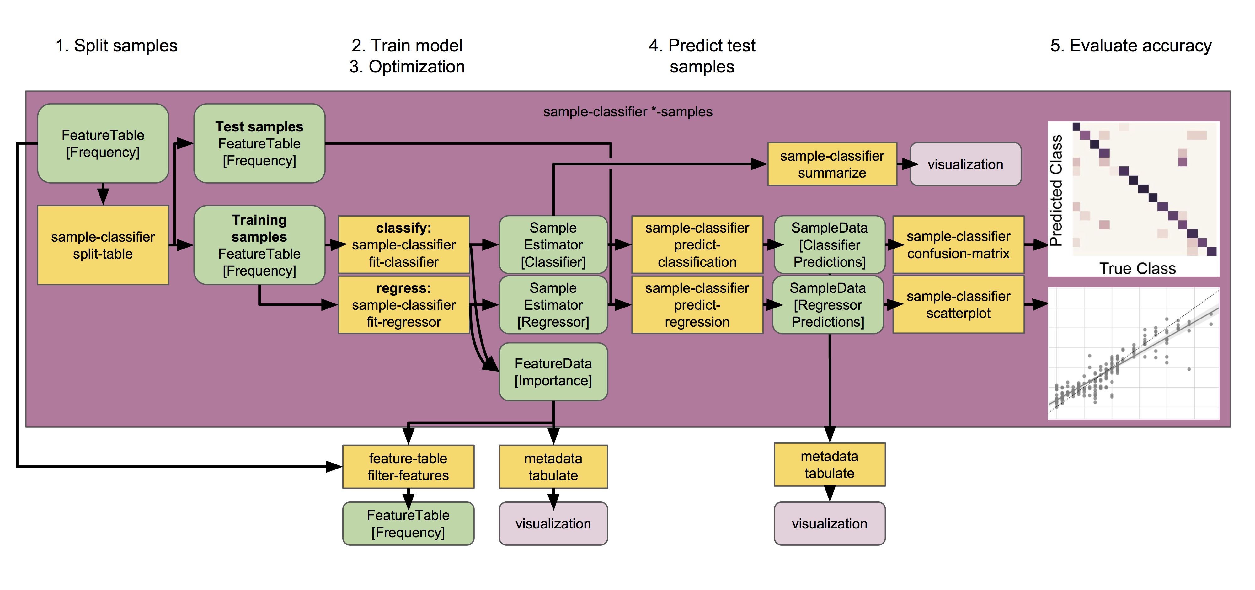
Supervised learning classifiers perform series of steps to predict metadata groups from microbiome profiles. Source: https://docs.qiime2.org/2018.8/tutorials/sample-classifier/
qiime sample-classifier classify-samples \
   --i-table "$table" \
   --m-metadata-file "$map" \
   --m-metadata-column bmi_cat \
   --p-optimize-feature-selection \
   --p-parameter-tuning \
   --p-estimator RandomForestClassifier \
   --p-n-estimators 20 \
   --output-dir american_gut/3_0_random_forest_bmi_cat

qiime tools view american_gut/3_0_random_forest_bmi_cat/visualization.qzv
- Note the caveats, and that you should do a lot more background before throwing advanced statistics around!
- QIIME2 is great for simple straight forward analyses, but to go deeper you need to do the legwork
- Don’t get caught presenting results you cannot explain thoroughly!
- There are so many other options for analyses, investigate but always use caution
- The microbiome field as we know it is ~10 years old
- Wild-west of statistics and assumptions, best practices are only starting to be enforced